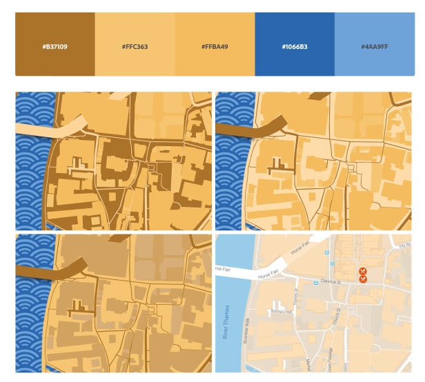
For my map, I want to use a warmer or muted scheme so that it is comfortable to look at and so, using Adobe Color, I created some colour swatches that I believe would convey that.
I used the complementary and shades arrangement on Adobe Color and found that fewer of the complementary colour swatches offered the subtlety that I was looking for.
These are my most preferred swatches out of the 6.
Colour Tests
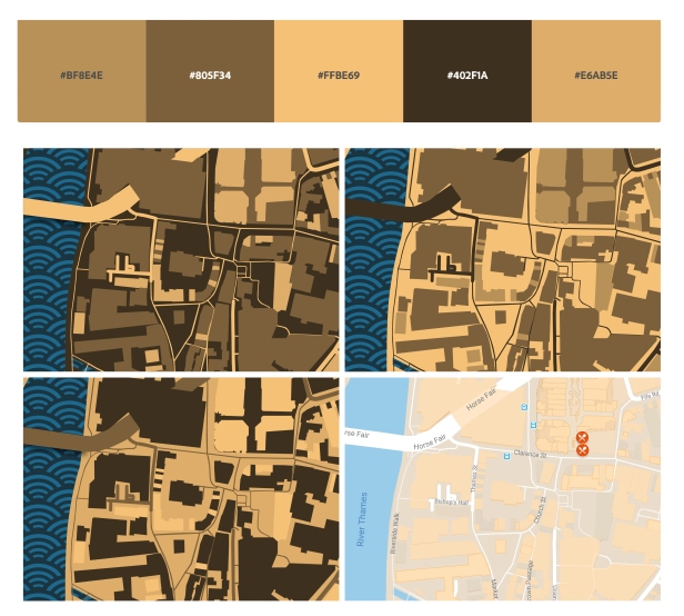
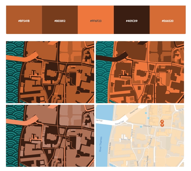
Using Adobe Illustrator, I traced a section of my map template and applied my chosen colour schemes to test how I might use the colours and if they work well together.

With swatch 6, I found that it looked too similar to the default google maps colour scheme. Whilst it is comfortable to look at, I don’t want this kind of design.

With this colour scheme, I feel that the colours work very well together and so are easy to look at. I can also see how I might use the colours on the other pages of my leaflet and so I will consider this swatch for my final design. Despite this, it does create quite a dark design and so I need to be wary of that.

In this test, I tried using green for the water pattern and I like how it has turned out. This scheme is warm like I wanted and the complimentary green could serve as an interesting accent throughout the rest of the leaflet.


