
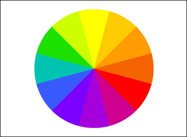
There are 3 primary colours: red, blue and yellow. These colours cannot be mixed using other colours but can be mixed together in different ways to make secondary colours. Secondary colours are mixed by using the primary colours
red + blue = purple
red + yellow = orange
blue + yellow = green
red + blue + yellow = brown
Purple, orange, green and brown are the basic colours made by primary colours. purple orange and green are secondary colours whilst brown is a tertiary colour. However, there are many different versions of these colours thanks to 3 fundamental components that help to define a colour and understand colour theory:
Hue
This is the colour’s position on the colour wheel and can be measured in degrees, ranging from 0 to 359. For example, a yellow colour would generally be between 50 and 60 degrees, leaving a lot of room for variations of yellow.
Saturation
This refers to how rich a colour is and so low saturation of colour results in less of the base pigment in that colour. It is usually measured as a percentage from 0 to 100%.
Brightness
This is how bright a colour is and is also measured as a percentage. A red at 0% brightness would be black and at 100% would be the red at full colour.
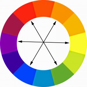
Complementary colours are colours that, when mixed, cancel each other out and make a greyscale-like colour. When placed next to each other, however, they help each other to stand out. The complementary colours are pairs of colours that are opposite one another on the colour wheel: yellow + purple, blue + orange, red + green etc.
They stand out against each other so well because they are contrasting. As well as making greyscale colours when mixed, complementary colours can be added to each other to make a less vibrant version of the base colour and so the more you add, the more neutral it will become. From this, we can gather that complementary colours have many uses.

Analogous colours are colours that sit next to each other on the colour wheel. They match well and are helpful to use when trying to create comfortable designs. For the colours to be considered analogous, it is usually 3 to 5 that are used.
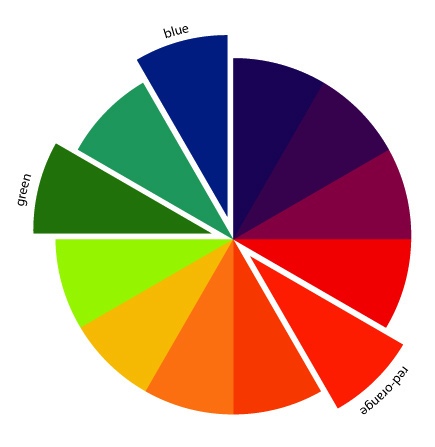
Split-complementary colours involve a base colour and the two colours either side of its complementary colour on the colour wheel. This colour scheme still allows for a strong visual contrast but has less tension as it does not use the directly contrasting colour to the base one – but variations of it.
Thanks for reading ~
